Pinterest is a gold mine not only for ideas but also for blog traffic. Think about it as a cork-board of sorts, albeit a digital one. I stumbled upon it a few years back and because it satiated my OCD tendencies, *hoorah neat freaks* I used it on the regular. Quite accidentally too, I happen to have pinned images from this site which went viral over the said platform sending massive traffic to my then one year old blog. So today I decided to share some of the tips I've learned while using Pinterest as a blogger's tool. Ready?

Pinterest is a huge potluck of inspiration. From inspirational quotes, DIY projects, ootds, home decor, party ideas, hair and beauty tutorials, recipes, travel itineraries, infographics, name it and it's probably in there. As a blogger, coming up with topics to write about can be a challenge. It's easy to get stuck in a rut when you're just not having any of that mojo. Sometimes you need something to trigger it. With all the creativity and inspiration from the platform, it's bound to stir up your stimulus and spark some ideas to get you by. It also helps that pins are organized and can be browsed by category.

The platform allows users to group and organize pins into so called boards. Pins are images which when clicked will direct you to its originating site. This is a neat way to organize blog ideas and inspirations for your next post. Plus, it's more visually appetizing and systematic compared to bookmarks on your browser.

Secret boards are set to private so no one else can view them but yourself. One of my secret boards, that happens to no longer be confidential as of this writing, contains pins of home decor from sites like Ikea and Anthropologie which I'm planning to make DIY versions of. They're also great for boards which you won't be keeping for long and would be deleting soon after such as sponsored post materials.

When writing sponsored posts (like this, this and this), bloggers need to gather several images and links. Bookmarking each one can be such a huge pain and doing so also makes it hard to visualize the concept. Instead, use a secret board to gather all the said images and links. Think about it as a mood-board. Once you're done with your blog post, you can delete it afterwards. That simple.

It helps to use witty and fun titles to your boards and pins. It adds a pack of punch and creative juice to your profile. But at the same time, they have to be vivid and descriptive so that people can search, follow and repin them easily.

Each board must be aptly labeled with a description and set to the most relevant category. This makes them more searchable, thus allowing for better reach and eventually more traffic. Remember, Pinterest categorizes posts and shows relevant pins on user feeds depending on their interests, latest pins and recently visited sites.

Now that we've touched the topic about traffic, the platform can be very powerful in bringing huge amounts of visitors to your site. Of course, you must also do your end of the bargain. Make your blog Pinterest friendly. To do this, make sure that you use quality images. Keep in mind that the platform banks heavily on visuals and your post is more likely to be pinned when it has aesthetically appealing and quality images. At the same time, make it easy for readers to pin a post by adding a "pin it hover button". Head on over to this tutorial to learn how.

When a reader pins an image from your blog, Pinterest automatically pulls the Alt and Title attributes as the description. Readers can always edit the said description (although many don't bother to) but bloggers can have the upper hand by providing the said attributes firsthand for SEO purposes. Learn how to add the Alt and Title image attributes with this tutorial.

Make sure that you let your readers know about your Pinterest profile. Depending on your preferred theme or layout, you can display it on your sidebar, navbar or at the end of each post. Whatever floats your boat. It won't hurt to share it on your other social media profiles too.

This last tip isn't a necessity but something that I find visually pleasing and helps better communicate your branding. Each blogger has their own aesthetic and personality, a brand as some would call it. The platform allows users to choose a particular pin as a "cover" or display image for each board. Pinterest automatically displays your first pin on a specific board as the cover but you can change it by clicking Edit > Change Cover > Save.
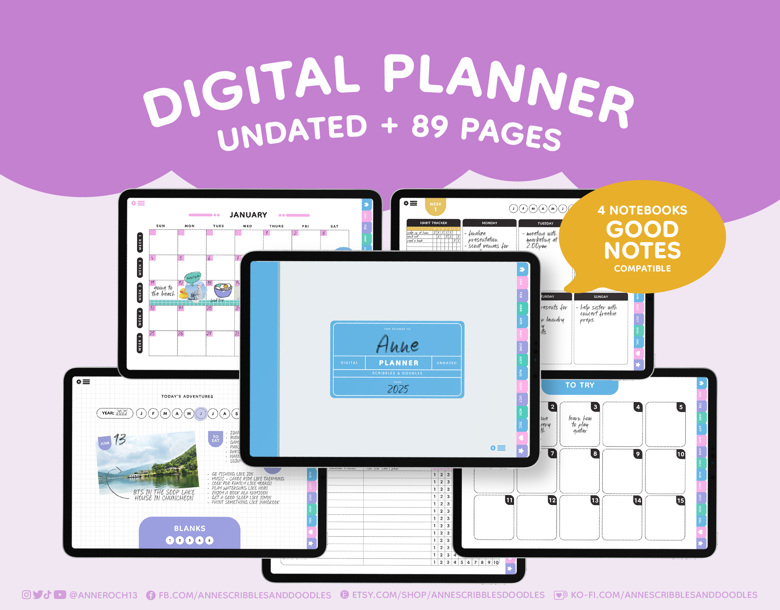
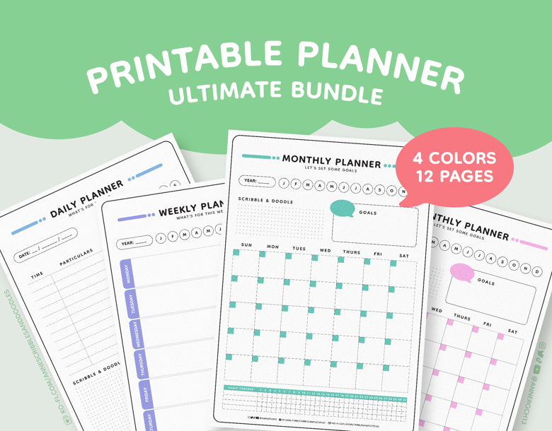
When you take a look at a pinner's profile, you'd see their boards on display just like mine below. I chose to make covers of a particular color scheme, went with my "doodle" theme and aptly incorporated labels. Doing this made everything look cohesive. It was quite a lot of work to be honest since I had to scan some of my drawings, looked for creative commons and bought some stock images but it was worth it in the end. In order to incorporate them into each board, you'd have to pin an image from your device instead of from a site. It's akin to uploading really. I've experimented on the dimensions and found that 780x580 works best.
UPDATE: Pinterest has changed its layout creating unattractive distortions to how your profile and boards are seen on desktop and mobile. I've spent a good amount of time scouring the internet for the best fix to avoid the awkward cropping across all platforms and found this one from Kelly. It has a step-by-step tutorial as well as a free downloadable template. Here's how my Pinterest page currently looks on desktop and on mobile respectively.


Are you ready to get lost in Pinterest-land? Take your blogging up a notch and use the platform to tickle your inspiration, up your productivity game and boost your site's traffic. I hope you found these tips quite handy. Oh and don't forget to check out my Pinterest profile too!


0 comments:
Post a Comment